Data Visualization & Design
-

Graphic for NYT: Did Britain Win the Trade War? Why It’s Tough to Declare a Victor.
Sketched and mocked up graphics for this story on the varying tariff rates for different products. Story by Eshe Nelson and Jeanna Smialek. Visuals (graphics) by me and illustrations by Lucia Calfapietra
Tools: Figma
-

Graphic for The New York Times' live blog
Sourced data, interviewed data source, and generated a chart within a few hours to show that Iranians lost internet access during the Iran-Israel war.
Tools: Datawrapper, Google Sheets, Data reporting, Interviewing
-

Voter Registration Graphic
Graphic created for a story by Shane Goldmacher with data journalist Jonah Smith on the decline of voter registrations in the Democratic party and the rise in the Republican party. The White House account reposted this graphic on X.
Tools: Mapshaper, Illustrator, Google Sheets
-

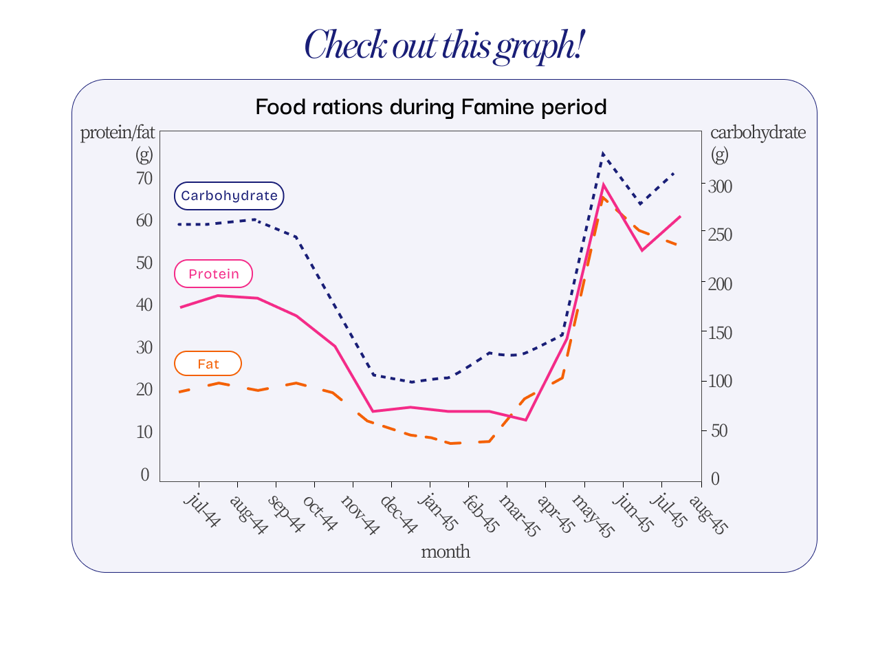
Graph re-skin
A fast visual refresh case study that modernizes an existing chart and social post, improving hierarchy and brand alignment for clearer, more effective visuals.
-

Parsons x The Smithsonian Institution - "Worn Worlds: A Textile Exhibition"
Sanidhya Sharma and I bring together textiles from the Freer & Sackler Galleries and the Cooper Hewitt Design Museum, to present a vibrant tapestry of textile images that users can filter by continent, color, material, and technique. Each textile reveals metadata, including its origin and period, creating a historiographical tool to study the complexity of textiles.
Data: Textiles in the Freer Gallery of Art and Arthur M. Sackler Gallery and the Cooper Hewitt, Smithsonian Design MuseumTools: D3.js, HTML, CSS, Smithsonian Open Access API, Python
[In progress] -

Tennis in NYC
A UX/UI project focused on designing for usability and helping users navigate the tennis system in NYC. Includes user research, user journey mapping, wireframing, interactive prototyping, user testing, and evaluation.
Tools: Figma, Miro, Interviewing, User Research, Testing, and Evaluation -

Who Goes to Space?
An interactive data visualization and microsite exploring Supercluster’s Astronaut Database, analyzing five main variables — geography, gender, occupation, years, and time spent in space. Five graphics and visuals were created from processing and analyzing the database.
Tools: D3.js, JavaScript
-

Graphics for The New York Times
Map designs for the story ‘Trump Shrank Staffing of National Parks. See How Many Are Struggling.’ The story by Eileen Sullivan and photos by Erin Schaff and my graphics were also published in print.
Tools: Mapshaper, Adobe Illustrator, Ai2html, Google Sheets/Excel
-

Narratives of Truth and Denial
An interactive webpage of how historical denial spreads online. Using machine learning to classify over 10,000 YouTube comments, this project reveals striking overlaps between official narratives and public discourse, showing how digital platforms help sustain contested histories. I created an accompanying research paper, a video, and a public keynote presentation to introduce, summarize, document, and showcase the findings.
Tools: D3.js, Vue.js, machine learning, Gemini, JavaScript, Adobe Premiere Pro, Photoshop, After Effects, Adobe Audition
-

Global Earthquakes in the Past Month
An interactive map visualizing earthquake data from the USGS. Earthquakes populate the map with their time stamps and are sized based on the magnitude of the earthquake. Users can click on the points on the map to view more information including location, date, and depth of the earthquake. Additionally, a button was developed to pan to the largest earthquake in the past month.
Tools: D3.js, USGS API, and Leaflet
-

Map of Anchorage for The New York Times
Map for a live blog on the Russia and U.S. Summit that took place in Anchorage, Alaska in August 2025.
Tools: Mapshaper, Illustrator
-

Jobs Day Graphic for The New York Times
Suite of three charts and visualizations of the jobs report released in July 2025.
Tools: Datawrapper, Illustrator, Ai2html
-

The Political Matrix of Digital Platforms
Prototype for an interactive tracker of social media content moderation policies, leaders, and platforms from 2015-2025 on a political compass.
-

Data Physicalization
Exploring Hart Island's history as a mass burial site for marginalized individuals since 1869. It visualizes and memorializes available records from 1980 onward, while emphasizing the missing and "unknown" data prior to that. Through tactile and historical reflection, the project fosters dialogue on memory, loss, and marginalized communities.
Tools: laser cutter, acrylic, and Adobe After Effects -

Sounds of My Days
In this Quantified Self project, I investigated the relationship between my mood and the music I listen to over a 10-day period. I developed a method to self-record my mood on a scale of 1-5 and utilize Spotify's API to extract key audio features from the songs. The project culminated in a dynamic data presentation allowing users to view the data for each day via a slider. Skills learned include data processing, analysis, data structure, and user design.
Tools: D3.js, JavaScript, Python, ChatGPT, Spotify’s API
-

Abstract Clock
A live clock that represents time in an unconventional way. Inspired by tapestry and stitches as a representation of time passing, I created this 24 hour clock where seconds are represented by the addition of overlapping semi-transparent circles, minutes by the larger circle’s increasing radius, and the hour (24-hr clock) represented by the angled lines. This was developed as an introductory project for a Data Visualization and Information Aesthetics course.
Tools: D3.js, HTML, CSS
-

Quantifying the Yields of Exploration: As found in the Natural History Museum collections at the Smithsonian
A quantitative project using the Smithsonian’s Open Access API. Here, I go through the process of extracting data from the Smithsonian API, creating a mock in Figma, and coding an interactive visualization for exploring the material housed in the Natural History Museums at the Smithsonian through the lens of scientific expeditions.
Tools: D3.js, Figma, JavaScript, Github, Smithsonian API
-

Parameterizing Faces on Global Currency
Study and sketch exploring the concept of parameters in p5.js, using portraits on different countries’ paper currency.
Tools: P5.js, ChatGPT, Adobe Illustrator